Update 03/20/15: We have found in continuing our tests of this penalty, the Mobile Friendly tag does not appear on Windows phones. If you have a Windows phone, please use the mobile usability text found later on in this post to determine if your site is mobile friendly.
April 21st is quickly approaching and Google is threatening a penalty bigger than any other we have seen. According to Google’s Zineb Ait Bahajji, the upcoming changes will have a greater impact on search result then Panda or Penguin, which is saying something. Please keep in mind that this upcoming change will only affect mobile traffic. According to Google, this will not affect how your site shows up on a desktop search. I would add a “yet” to that statement.
Consider this: Google has over 48,000 searches per second. That’s about 3.5 BILLION searches a day. 50% of that is 1.75 billion searches a day. Re-read that sentence. Being suppressed in that many Google search results could have a damning affect on how many leads you get from your website.
Honestly, I think we can call this the death knell of the old Internet. No longer can companies get away with ignoring their mobile users. Old coding practices and outdated designs most likely already cost you customers, but with the Mobile Friendly changes that Google is heralding, you could lose rankings for having a non-mobile version of your website.
Don’t think that just because you have a responsive website that you’re out of the woods. I want to look at how responsive designs stack up against Google mobile guidelines.
What I Mean By Responsive Website
Responsive web design is considered the best practice and has been for a while now. Having a website that automatically adjusts to the view portal of your user (be it desktop, tablet, or mobile) should cover all of your bases when it comes to ease of use on mobile devices.
This means coding your site to specific media queries, allowing your site to break apart at set seams. So for example, here’s how our website looks at the three big media queries for Desktop (960px and up), Tablet (786px to 1024px), and Mobile (360px to 480px).


However, that doesn’t mean that our site is automatically mobile friendly.
What Google Means By Mobile Friendly
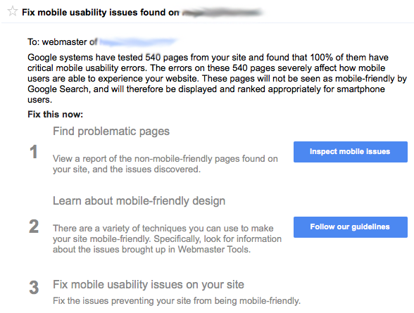
Let’s take a look at an actual warning one of our clients got this morning.
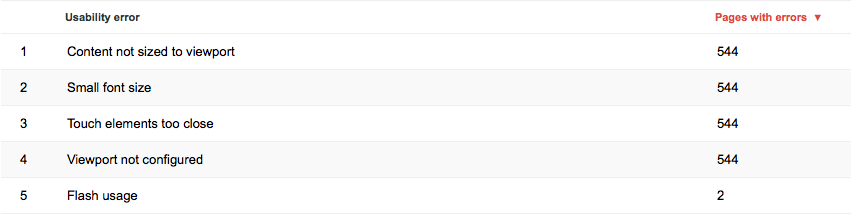
Content Not Sized To Viewport
We see this error when content needs to be horizontally scrolled in order to see it all. For the most part, a well-designed responsive page should fix this problem. However, if there is something amiss with your media queries, if there is a broken Div tag, or if you don’t include code that targets your sidebar, you could see this warning on your responsive site.
If you see this warning, you need to look through the pages it lists for any broken code that would be causing the horizontal scroll. If you are getting this warning on every page on your responsive site, you’ll want to check your media queries and ensure that all elements on the page have been addressed in your fluid layout. The most common cause we’ve seen of this issue is an error in dealing with the sidebar.
Small Font Size
Luckily, this is the easiest one to fix. Google wants to see a base font size of 16 CSS pixels. A CSS pixel will change based on device size and density of pixels on the device. So a CSS pixel on a retina display will be different then a CSS pixel on a 640×480 computer monitor.
Changing this is as easy as editing your CSS to have a base font size of 16px; you could also use EM as your size, with 1EM being the recommendation.
It’s also important to note that line-height plays an important role in how your website looks on mobile. Google recommends a 1.2 EM line-height, the browser default.
Also, stay away from using too many different fonts and font sizes. They can crowd the screen on smaller viewports.
Touch Elements are too Close
This one is a bit harder to fix as it is triggered by links that buttons that are too close to other elements on the page that make it hard for users to click touch the exact element they want.
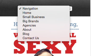
Here’s an example of this.

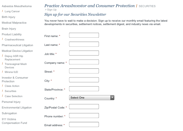
If the problem is being caused by your navigation, you may want to think about changing your menu to either be a dropdown on the mobile level or having it fly in from either side of the screen.
Here’s an example of the dropdown:

Google recommends that items most users are going to touch be at least 48 CSS pixels tall/wide with less used links and buttons having at least 32 CSS pixels of clearance from other touch elements so they are easy to click.
If your users have to pinch zoom in order to click on your links, you need to rethink your mobile design.
Viewport Not Configured
If you have a responsive site, you shouldn’t have an issue with this warning. However, if you have not defined at least the three big viewports (Desktop, Tablet, Mobile) you may see this warning.
Fixing it is just a matter of ensuring your media queries are defined properly. Make sure that you have a media query for mobile devices between 320px and 480px, table devices between 768px and 1024px, and anything greater than 960px (which would be desktop devices).
Flash Usage
Most mobile devices cannot display Flash content. Instead of using Flash to generate that content you should use modern web technologies, like HTML5, to create that content so that it can be experienced regardless of the device being used to access it.
Depending on your budget, it may be easier to remove the flash content from the page.
Blocking CSS or Javascript
This isn’t one of the errors in our screenshot but there has been a lot of chatter on the Google forums about this being a factor in mobile friendliness. You can read more about this here.
The important take away here is that “Disallowing crawling of Javascript or CSS files in your site’s robots.txt directly harms how well our algorithms render and index your content and can result in suboptimal rankings.”
How do you know if are blocking or disallowing Google from crawling such files? Try fetching and rendering your page as Google in your Webmaster tools account. If you get any crawl errors, indexing issues, or other such signs of hardship from Google, you need to check your site of improper use of either your .htaccess file or your robots.txt file.
What This Means To You
Overall, if you have a responsive website, you should be 95% in the clear. However, depending on who coded your website and how they coded your website, there may be a few errors that could cause your site to be affected by the upcoming changes Google has announced.
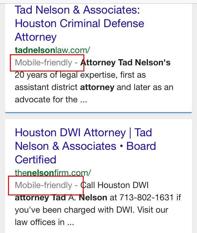
One sure-fire way of knowing you are in the clear is to see if your site comes up with the Mobile Friendly tag in a mobile search. The best way to do this is do a search for your brand name on your phone and check for the tag. If looks like this:
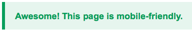
If you don’t see the tag, or if you want to make sure that your site is mobile friendly, you can test it here: https://www.google.com/webmasters/tools/mobile-friendly. Put in your URL in and let it do its thing. Once it’s done, if you get this message:
If, however, you get this message:
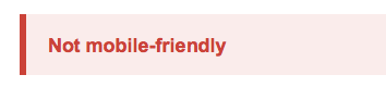

You have until April 21st to fix any mobile usability issues.
Please Note: You need to check your site page by page. This update will check each page of your site so even if you get a green tag on one page, don’t assume you will on every page.
If you care about your mobile traffic, take the steps needed to make sure you get the mobile friendly tag in a mobile search for your brand or the green message in Google’s mobile-friendly test.
Disclaimer: End of the world theories and suggestions made in this post are non-binding. Any attempt by the author to compare a Google update to the apocalypse is purely from a metaphorical stand point and not the views of this company as whole.